I built the feature my swim training was missing
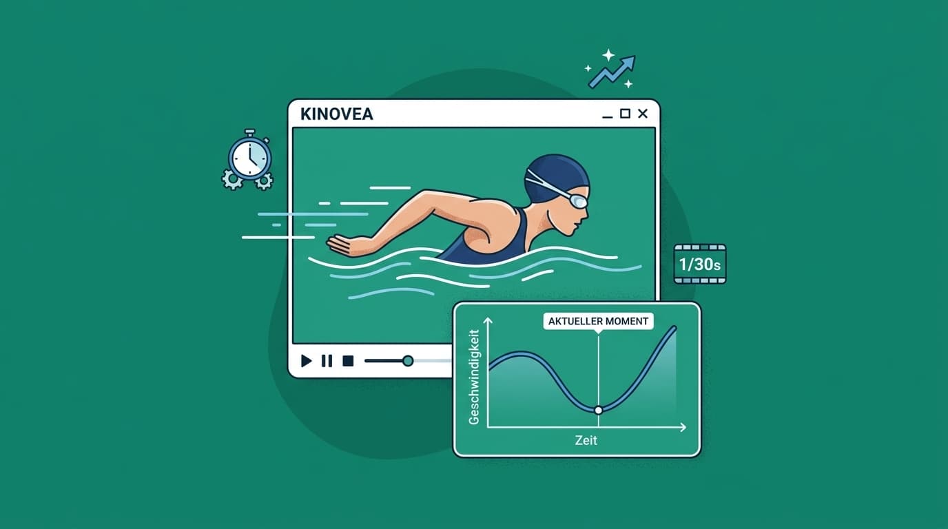
This morning I did turn training in the pool: breaststroke turns, tumble turns, 15 meters swim-in, turn, 15 meters push-off. We filmed it and looked at it in Kinovea. It's a free, open source video analysis tool used a lot in sports. You track a point in the video, and it shows you the speed of that point at every moment.
That's great, but something was missing. You only see the current number while the video plays. You never see the whole curve. On a turn that's exactly what matters: how much speed do I lose going into the wall, and how fast am I back up after the push-off? One number at a time can't show you that.
So I built it.
What it does
There's now a graph right under the video. Time on the x-axis, speed of the tracked point on the y-axis. The whole curve is visible from the start. When you play the video, a thin vertical line moves along the curve and shows exactly where you are.
It also works the other way around. Click anywhere in the graph and the video jumps to that moment. Hold the mouse and drag, and you scrub through the turn. See a dip in the curve? One click and you're looking at the frame where it happens.
You can put more than one track into the same graph, each in its own color. That way you can compare two turns, or two swimmers, on top of each other. And since everyone on our team speaks German, the labels are in German too.
How I built it
Kinovea is a Windows program, and I work on a Mac. I can't even build it on my laptop. So I write the code on the Mac, GitHub builds it on a Windows machine in the cloud, and I test the result in a Windows virtual machine. Push, wait, download, test. Not the fastest loop, but it works. I wrote the code together with Claude Code.
The bug you only find by using it
All tests were green. Then I clicked into the graph and used the arrow keys to step through the video frame by frame, like you always do in video analysis. The video moved. The graph moved too, sideways, right out of view.
The chart library has its own keyboard shortcuts, and the arrow keys move the chart. After a click, the graph had the focus, so both reacted to the same key. The fix was small: the graph now ignores the keyboard. But no test would have found this. You only find it by actually using the thing.
What's next
I showed it to our sports scientist. He really liked it and was honestly impressed that it went from "this is missing" to working software in a day. He started thinking out loud right away about what else it could show and how we could use it in our training.
So that's the next step: we're going to sit down together and talk about how to improve it further and how to make it part of our everyday training.